
1 contributor

Like
Install shadow-definition as a package?
Copied
npm i @bit/bit.base-ui.theme.shadow-definition
Set Bit as a scoped registryLearn more
npm config set '@bit:registry' https://node.bit.cloud
Component Example 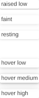
React
React
Vue
Angular
React Native
Add dependency... help_outline
Just any of the 1 million components
and packages in Bit or NPM to the example.toggle layout

chevron_left
chevron_right
theme/shadowDefinition ()
Shadow CSS-variables definitions.
--elevation-none: none;

//raised, ie attached to background
--shadow-raised-low: 0 -1px 1px 0 rgba(0, 0, 0, 0.09), 0 2px 2px 0 rgba(0, 0, 0, 0.23);
// --shadow-raised-medium: //TBD;
// --shadow-raised-hight: //TBD;

//not final
--shadow-faint: 0 2px 10px 0 rgba(0, 0, 0, 0.1);

// hover, ie. floating above
--shadow-hover-low: 0 2px 8px 0 rgba(0, 0, 0, 0.2);
--shadow-hover-medium: 0 0 20px 0 rgba(0, 0, 0, 0.12), 0 2px 6px 0 rgba(0, 0, 0, 0.24);
--shadow-hover-high: 0px 11px 29px 0px rgba(0, 0, 0, 0.23);
To use, add class shadowTheme to your root component.