activity-block
v0.1.9arrow_drop_downv0.1.9
v0.1.8
v0.1.7
v0.1.6
v0.1.5
v0.1.4
v0.1.3
v0.1.2
v0.1.1
v0.1.0
STATUS
Passing
DOWNLOADS
118
VISIBILITY
Public
PUBLISHED
4 years ago
SIZE
103 KB
1 contributor

Like
Install activity-block as a package?
Copied
npm i @bit/clui.nui-ui.blocks.tutorial.activity-block
Set Bit as a scoped registryLearn more
npm config set '@bit:registry' https://node.bit.cloud
Component Example 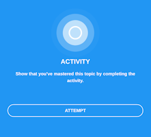
React
React
Vue
Angular
React Native
Add dependency... help_outline
Just any of the 1 million components
and packages in Bit or NPM to the example.toggle layout

chevron_left
chevron_right
Description
Block for showing the status and link to activity.
Import from bit.dev
https://bit.dev/clui/nui-ui/blocks/tutorial/activity-block
yarn add @bit/clui.nui-ui.blocks.tutorial.activity-block
import ActivityBlock from '@bit/clui.nui-ui.blocks.tutorial.activity-block';
Props
This component inherits ui/common/section-block. Please refer to /?path=/story/ui-common-sectionblock–default for all the inherited props.
Below are the props defined for this component:
| Name | Type | Default | Description |
|---|---|---|---|
| title | string | - | - |
| html | string | - | - |
| activityURL | string | - | - |
| completed | string | - | - |
| html | boolean | - | - |
| disabled | boolean | - | - |
| buttonLabel | string | - | - |
Properties
| Name | Type | Default value |
|---|---|---|
title | string | |
html | string | |
activityURL (required) | string | |
completed | boolean | |
disabled | boolean | |
buttonLabel | string | "Attempt" |