progress-block
v0.1.5arrow_drop_downv0.1.5
v0.1.4
v0.1.3
v0.1.2
v0.1.1
v0.1.0
STATUS
Passing
DOWNLOADS
72
VISIBILITY
Public
PUBLISHED
4 years ago
SIZE
26 KB
1 contributor

Like
Install progress-block as a package?
Copied
npm i @bit/clui.nui-ui.blocks.tutorial.progress-block
Set Bit as a scoped registryLearn more
npm config set '@bit:registry' https://node.bit.cloud
Component Example 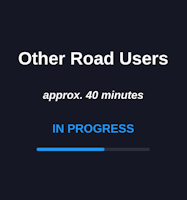
React
React
Vue
Angular
React Native
Add dependency... help_outline
Just any of the 1 million components
and packages in Bit or NPM to the example.toggle layout

chevron_left
chevron_right
Description
For showing the progress of the module, showing approx. duration, title, and module summary.
Import from bit.dev
https://bit.dev/clui/nui-ui/blocks/tutorial/information-block
yarn add @bit/clui.nui-ui.blocks.tutorial.information-block
import ProgressBlock from '@bit/clui.nui-ui.blocks.tutorial.information-block';
Props
This component inherits ui/common/section-block. Please refer to /?path=/story/ui-common-sectionblock–default for all the inherited props.
Below are the props defined for this component:
| Name | Type | Default | Description |
|---|---|---|---|
| progress* | number | - | - |
| duration* | string | - | - |
| title* | string | - | - |