grid
v0.1.5arrow_drop_downv0.1.5
v0.1.4
v0.1.3
v0.1.2
v0.1.1
v0.1.0
STATUS
Passing
DOWNLOADS
948
VISIBILITY
Public
PUBLISHED
4 years ago
SIZE
23 KB
1 contributor

Like
Install grid as a package?
Copied
npm i @bit/clui.nui-ui.ui.common.grid
Set Bit as a scoped registryLearn more
npm config set '@bit:registry' https://node.bit.cloud
Component Example 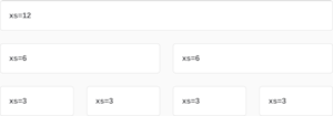
React
React
Vue
Angular
React Native
Add dependency... help_outline
Just any of the 1 million components
and packages in Bit or NPM to the example.toggle layout

chevron_left
chevron_right
Description
The Material Design responsive layout grid adapts to screen size and orientation, ensuring consistency across layouts.
Import from bit.dev
https://bit.dev/clui/nui-ui/ui/common/grid
yarn add @bit/clui.nui-ui.ui.common.grid
import Grid from '@bit/clui.nui-ui.ui.common.grid';
Props
This component inherits Mui Grid. Please refer to https://material-ui.com/api/grid/ for all the inherited props.
Below are the props defined for this component:
| Name | Type | Default | Description |
|---|---|---|---|
| order | number | - | - |
Properties
| Name | Type |
|---|---|
order | number |