question-card
v0.1.10arrow_drop_downv0.1.10
v0.1.9
v0.1.8
v0.1.7
v0.1.6
v0.1.5
v0.1.4
v0.1.3
v0.1.2
v0.1.1
v0.1.0
STATUS
Passing
DOWNLOADS
198
VISIBILITY
Public
PUBLISHED
4 years ago
SIZE
102 KB
1 contributor

Like
Install question-card as a package?
Copied
npm i @bit/clui.nui-ui.ui.tutorial.question-card
Set Bit as a scoped registryLearn more
npm config set '@bit:registry' https://node.bit.cloud
Component Example 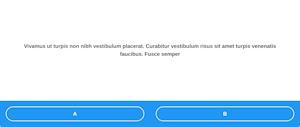
React
React
Vue
Angular
React Native
Add dependency... help_outline
Just any of the 1 million components
and packages in Bit or NPM to the example.toggle layout

chevron_left
chevron_right
Description
This is for constructing the QuestionBlock.
Import from bit.dev
https://bit.dev/clui/nui-ui/ui/common/question-card
yarn add @bit/clui.nui-ui.ui.common.question-card
import QuestionCard from '@bit/clui.nui-ui.ui.common.question-card';
Props
Below are the props defined for this component:
| Name | Type | Default | Description |
|---|---|---|---|
| html | string | - | - |
| textAlign | ‘inherit’ | ‘left’ | ‘center’ | ‘right’ | ‘justify’ | - | - |
| isPassed | boolean | - | - |
| actionsBlock | React.ReactElement | - | - |
| imgURL | string | - | - |
| imgAlt | string | - | - |
| imgAlignment | ‘left’ | ‘right’ | - | - |
| onClick | (event: React.MouseEvent<HTMLElement, MouseEvent>) => void | - | - |