
card
v2.0.2arrow_drop_downv2.0.2
v2.0.1
v2.0.0
v1.0.1
v1.0.0
STATUS
Failing
DOWNLOADS
27
VISIBILITY
Public
PUBLISHED
4 years ago
SIZE
4 KB
A wrapper resembling a physical card, grouping elements and improve readability.
1 contributor

Like
Install card as a package?
Copied
npm i @bit/kutner.temp.surfaces.card
Set Bit as a scoped registryLearn more
npm config set '@bit:registry' https://node.bit.cloud
Component Example 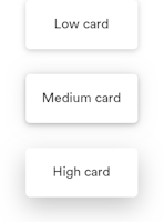
React
React
Vue
Angular
React Native
Add dependency... help_outline
Just any of the 1 million components
and packages in Bit or NPM to the example.toggle layout

chevron_left
chevron_right
Card ()
A wrapper resembling a physical card, grouping elements and improve readability.
Example
Properties
| Name | Type | Default value | Description |
|---|---|---|---|
elevation | ElevationHeight | 'low' | Controls the shadow cast by the card, to generate a “stacking” effects. For example, a modal floating over elements may have a ‘high’ elevation |
roundness | Roundness | 'default' | Controls the border radius of the card |
Test Summary
should render default card | Skipped |