
text-input
v0.1.2arrow_drop_downv0.1.2
STATUS
Failing
DOWNLOADS
333
VISIBILITY
Public
PUBLISHED
5 years ago
SIZE
6 KB
1 contributor

Like
Install text-input as a package?
Copied
npm i @bit/mmnoo.testing.text-input
Set Bit as a scoped registryLearn more
npm config set '@bit:registry' https://node.bit.cloud
Component Example 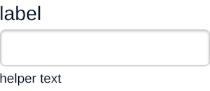
React
React
Vue
Angular
React Native
Add dependency... help_outline
Just any of the 1 million components
and packages in Bit or NPM to the example.toggle layout

chevron_left
chevron_right
<TextInput />
WIP
Usage
- Use the
textinput when you need a short, single line input from the user. - Use the
passwordinput when you need to mask an input.
Properties
| Name | Type/Example | Description |
|---|---|---|
type | text | password | Indicates the type of input. Defaults to text |
className | string | Class name of the div which encloses this element. Defaults to form-input and adds error-form-input when there’s an error. |
name | string | The name attribute of the element |
label | string | The label for the input. |
helperText | string | A short sentence describing what is required/expected |
isError | bool | Indicates if there’s an error. Will add the class error-form-input and make errorMessage required. |
errorMessage | string | If this exists, it shows the error message and adds the error class. |
Children
| Type | Default | Description |
|---|---|---|
string | undefined | The prepopulated value for the input. |
Aditional Notes
Properties
| Name | Type | Default value |
|---|---|---|
name | string | undefined |
id (required) | string | |
className | string | undefined |
onChange | function | () => {} |
label (required) | string | |
errorMessage | string | undefined |
children | string | undefined |
type | string | 'text' |
helperText | string | undefined |
Test Summary
replaceSpacesWithHyphens | Skipped |