


Like
Install app-bar as a package?
Copied
npm i @bit/mui-org.material-ui.app-bar
Set Bit as a scoped registryLearn more
npm config set '@bit:registry' https://node.bit.cloud
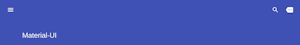
Component Example 


React
React
Vue
Angular
React Native
Add dependency... help_outline
Just any of the 1 million components
and packages in Bit or NPM to the example.toggle layout


chevron_left
chevron_right
The color of the component. It supports those theme colors that make sense for this component.
The positioning type. The behavior of the different options is described
in the MDN web docs.
Note: sticky is not universally supported and will fall back to static when unavailable.
Properties
| Name | Type | Description |
|---|---|---|
children | node | The content of the component. |
classes | object | Override or extend the styles applied to the component. See CSS API below for more details. |
className | string | |
color | 'default' | 'inherit' | 'primary' | 'secondary' | 'transparent' | The color of the component. It supports those theme colors that make sense for this component. |
position | 'absolute' | 'fixed' | 'relative' | 'static' | 'sticky' | The positioning type. The behavior of the different options is described
in the MDN web docs.
Note: |