
bottom-navigation
v4.9.10arrow_drop_downv4.9.10
v4.5.2
v3.9.2
STATUS
Passing
DOWNLOADS
1,071
LICENSE
MIT
VISIBILITY
Public
PUBLISHED
4 years ago
SIZE
24 KB
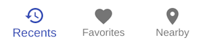
Bottom navigation bars display three to five destinations at the bottom of a screen. Each destination is represented by an icon and an optional text label. When a bottom navigation icon is tapped, the user is taken to the top-level navigation destination associated with that icon.


Install bottom-navigation as a package?
Copied
npm i @bit/mui-org.material-ui.bottom-navigation
Set Bit as a scoped registryLearn more
npm config set '@bit:registry' https://node.bit.cloud
Component Example 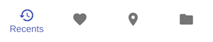
React
React
Vue
Angular
React Native
Add dependency... help_outline
Just any of the 1 million components
and packages in Bit or NPM to the example.toggle layout


chevron_left
chevron_right
Callback fired when the value changes.
If true, all BottomNavigationActions will show their labels.
By default, only the selected BottomNavigationAction will show its label.
The value of the currently selected BottomNavigationAction.
Properties
| Name | Type | Description |
|---|---|---|
children | node | The content of the component. |
classes | object | Override or extend the styles applied to the component. See CSS API below for more details. |
className | string | |
component | elementType | The component used for the root node. Either a string to use a DOM element or a component. |
onChange | function | The event source of the callback. |
showLabels | bool | If |
value | any | The value of the currently selected |