breadcrumbs
v4.9.10arrow_drop_down


| Name | Type | Description |
|---|---|---|
classes (required) | object | |
children (required) | node | The breadcrumb children. |
classes (required) | object | Override or extend the styles applied to the component. See CSS API below for more details. |
className | string | |
component | elementType | The component used for the root node. Either a string to use a DOM element or a component. By default, it maps the variant to a good default headline component. |
expandText | string | Override the default label for the expand button. For localization purposes, you can use the provided translations. |
itemsAfterCollapse | number | If max items is exceeded, the number of items to show after the ellipsis. |
itemsBeforeCollapse | number | If max items is exceeded, the number of items to show before the ellipsis. |
maxItems | number | Specifies the maximum number of breadcrumbs to display. When there are more
than the maximum number, only the first |
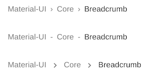
separator | node | Custom separator node. |

