drawer
v4.9.10arrow_drop_down


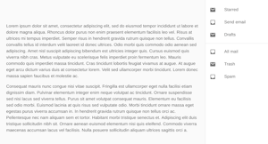
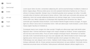
Side from which the drawer will appear.
The contents of the drawer.
The elevation of the drawer.
Props applied to the Modal element.
Callback fired when the component requests to be closed.
If true, the drawer is open.
Props applied to the Paper element.
Props applied to the Slide element.
The duration for the transition, in milliseconds. You may specify a single timeout for all transitions, or individually with an object.
The variant to use.
The props of the Modal component are available
when variant="temporary" is set.
Demos:
API:
The props of the Modal component are available
when variant="temporary" is set.
| Name | Type | Description |
|---|---|---|
anchor | 'bottom' | 'left' | 'right' | 'top' | Side from which the drawer will appear. |
BackdropProps | object | |
children | node | The contents of the drawer. |
classes | object | Override or extend the styles applied to the component. See CSS API below for more details. |
className | string | |
elevation | number | The elevation of the drawer. |
ModalProps | object | Props applied to the |
onClose | function | The event source of the callback. |
open | bool | If |
PaperProps | object | Props applied to the |
SlideProps | object | Props applied to the |
transitionDuration | number | {"appear":"number","enter":"number","exit":"number"} | The duration for the transition, in milliseconds. You may specify a single timeout for all transitions, or individually with an object. |
variant | 'permanent' | 'persistent' | 'temporary' | The variant to use. |


