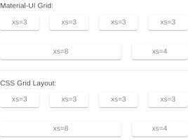
grid
v4.9.10arrow_drop_down


| Name | Type | Description |
|---|---|---|
alignContent | 'stretch' | 'center' | 'flex-start' | 'flex-end' | 'space-between' | 'space-around' | Defines the |
alignItems | 'flex-start' | 'center' | 'flex-end' | 'stretch' | 'baseline' | Defines the |
children | node | The content of the component. |
classes (required) | object | Override or extend the styles applied to the component. See CSS API below for more details. |
className | string | |
component | elementType | The component used for the root node. Either a string to use a DOM element or a component. |
container | bool | If |
direction | 'row' | 'row-reverse' | 'column' | 'column-reverse' | Defines the |
item | bool | If |
justify | 'flex-start' | 'center' | 'flex-end' | 'space-between' | 'space-around' | 'space-evenly' | Defines the |
lg | false | 'auto' | true | 1 | 2 | 3 | 4 | 5 | 6 | 7 | 8 | 9 | 10 | 11 | 12 | Defines the number of grids the component is going to use.
It’s applied for the |
md | false | 'auto' | true | 1 | 2 | 3 | 4 | 5 | 6 | 7 | 8 | 9 | 10 | 11 | 12 | Defines the number of grids the component is going to use.
It’s applied for the |
sm | false | 'auto' | true | 1 | 2 | 3 | 4 | 5 | 6 | 7 | 8 | 9 | 10 | 11 | 12 | Defines the number of grids the component is going to use.
It’s applied for the |
spacing | 0 | 1 | 2 | 3 | 4 | 5 | 6 | 7 | 8 | 9 | 10 | Defines the space between the type |
wrap | 'nowrap' | 'wrap' | 'wrap-reverse' | Defines the |
xl | false | 'auto' | true | 1 | 2 | 3 | 4 | 5 | 6 | 7 | 8 | 9 | 10 | 11 | 12 | Defines the number of grids the component is going to use.
It’s applied for the |
xs | false | 'auto' | true | 1 | 2 | 3 | 4 | 5 | 6 | 7 | 8 | 9 | 10 | 11 | 12 | Defines the number of grids the component is going to use. It’s applied for all the screen sizes with the lowest priority. |
zeroMinWidth | bool | If |


