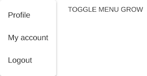
menu-item
v4.9.10arrow_drop_downv4.9.10
v4.5.2
v3.9.2
STATUS
Passing
DOWNLOADS
26,208
LICENSE
MIT
VISIBILITY
Public
PUBLISHED
4 years ago
SIZE
33 KB
`classes` prop applied to the [`ListItem`](/api/list-item/) element.
Install menu-item as a package?
Copied
npm i @bit/mui-org.material-ui.menu-item
Set Bit as a scoped registryLearn more
npm config set '@bit:registry' https://node.bit.cloud
Component Example 
React
React
Vue
Angular
React Native
Add dependency... help_outline
Just any of the 1 million components
and packages in Bit or NPM to the example.toggle layout

chevron_left
chevron_right
classes prop applied to the ListItem element.
Properties
| Name | Type | Description |
|---|---|---|
children | node | Menu item contents. |
classes (required) | object | Override or extend the styles applied to the component. See CSS API below for more details. |
className | string | |
component | elementType | The component used for the root node. Either a string to use a DOM element or a component. |
dense | bool | If |
disabled | bool | |
disableGutters | bool | If |
ListItemClasses | object |
|
role | string | |
selected | bool | |
tabIndex | number |


