slider
v4.9.10arrow_drop_down


| Name | Type | Description |
|---|---|---|
aria-label | custom | The label of the slider. |
aria-labelledby | string | The id of the element containing a label for the slider. |
aria-valuetext | custom | A string value that provides a user-friendly name for the current value of the slider. |
classes (required) | object | Override or extend the styles applied to the component. See CSS API below for more details. |
className | string | |
color | 'primary' | 'secondary' | The color of the component. It supports those theme colors that make sense for this component. |
component | elementType | The component used for the root node. Either a string to use a DOM element or a component. |
defaultValue | number | number[] | The default element value. Use when the component is not controlled. |
disabled | bool | If |
getAriaLabel | function | The thumb label’s index to format. |
getAriaValueText | function | The thumb label’s value to format. |
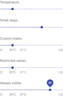
marks | bool | array | Marks indicate predetermined values to which the user can move the slider.
If |
max | number | The maximum allowed value of the slider. Should not be equal to min. |
min | number | The minimum allowed value of the slider. Should not be equal to max. |
name | string | Name attribute of the hidden |
onChange | function | The event source of the callback. |
onChangeCommitted | function | The event source of the callback. |
onMouseDown | function | |
orientation | 'horizontal' | 'vertical' | The slider orientation. |
scale | function | A transformation function, to change the scale of the slider. |
step | number | The granularity with which the slider can step through values. (A “discrete” slider.)
The When step is |
ThumbComponent | elementType | The component used to display the value label. |
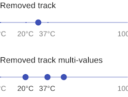
track | 'normal' | false | 'inverted' | The track presentation:
|
value | number | number[] | The value of the slider. For ranged sliders, provide an array with two values. |
ValueLabelComponent | elementType | The value label component. |
valueLabelDisplay | 'on' | 'auto' | 'off' | Controls when the value label is displayed:
|
valueLabelFormat | string | function | The format function the value label’s value. When a function is provided, it should have the following signature:
|

