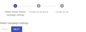


Set the active step (zero based index). Set to -1 to disable all the steps.
If set to ‘true’ and orientation is horizontal, then the step label will be positioned under the icon.
Two or more <Step /> components.
An element to be placed between each step.
If set the Stepper will not assist in controlling steps for linear flow.
The stepper orientation (layout flow direction).
| Name | Type | Description |
|---|---|---|
activeStep | number | Set the active step (zero based index). Set to -1 to disable all the steps. |
alternativeLabel | bool | If set to ‘true’ and orientation is horizontal, then the step label will be positioned under the icon. |
children | node | Two or more |
classes | object | Override or extend the styles applied to the component. See CSS API below for more details. |
className | string | |
connector | element | An element to be placed between each step. |
nonLinear | bool | If set the |
orientation | 'horizontal' | 'vertical' | The stepper orientation (layout flow direction). |


