
table
v4.9.10arrow_drop_downv4.9.10
v4.5.2
v3.9.2
STATUS
Passing
DOWNLOADS
8,900
LICENSE
MIT
VISIBILITY
Public
PUBLISHED
4 years ago
SIZE
24 KB
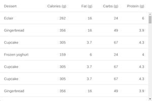
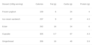
Data tables display information in a way that’s easy to scan, so that users can look for patterns and insights. They can be embedded in primary content, such as cards.


Like
Install table as a package?
Copied
npm i @bit/mui-org.material-ui.table
Set Bit as a scoped registryLearn more
npm config set '@bit:registry' https://node.bit.cloud
Component Example 


React
React
Vue
Angular
React Native
Add dependency... help_outline
Just any of the 1 million components
and packages in Bit or NPM to the example.toggle layout


chevron_left
chevron_right
Properties
| Name | Type | Description |
|---|---|---|
children (required) | node | The content of the table, normally |
classes (required) | object | Override or extend the styles applied to the component. See CSS API below for more details. |
className | string | |
component | elementType | The component used for the root node. Either a string to use a DOM element or a component. |
padding | 'default' | 'checkbox' | 'none' | Allows TableCells to inherit padding of the Table. |
size | 'small' | 'medium' | Allows TableCells to inherit size of the Table. |
stickyHeader | bool | Set the header sticky. ⚠️ It doesn’t work with IE 11. |