
styled-button
v0.0.1arrow_drop_downv0.0.1
STATUS
Passing
DOWNLOADS
48
VISIBILITY
Public
PUBLISHED
4 years ago
SIZE
15 KB
A simple shared Button component with three props: children, onClick and isPrimary
1 contributor

Like
Install styled-button as a package?
Copied
npm i @bit/nsebhastian.tutorial-examples.styled-button
Set Bit as a scoped registryLearn more
npm config set '@bit:registry' https://node.bit.cloud
Component Example 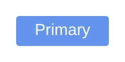
React
React
Vue
Angular
React Native
Add dependency... help_outline
Just any of the 1 million components
and packages in Bit or NPM to the example.toggle layout

chevron_left
chevron_right
Properties
| Name | Type | Default value | Description |
|---|---|---|---|
children (required) | node | The button content or label | |
onClick (required) | function | on click function | |
isPrimary | bool | true | style: primary button or not |