
checkbox
v4.15.0arrow_drop_downv4.15.0
STATUS
Passing
DOWNLOADS
20
LICENSE
MIT
VISIBILITY
Public
PUBLISHED
5 years ago
SIZE
160 KB
The Checkbox component maps to a checkbox input and a label.
1 contributor

Like
Install checkbox as a package?
Copied
npm i @bit/segmentio.evergreen.checkbox
Set Bit as a scoped registryLearn more
npm config set '@bit:registry' https://node.bit.cloud
Component Example 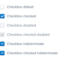
React
React
Vue
Angular
React Native
Add dependency... help_outline
Just any of the 1 million components
and packages in Bit or NPM to the example.toggle layout

chevron_left
chevron_right
Properties
| Name | Type | Default value | Description |
|---|---|---|---|
id | string | The id attribute of the checkbox. | |
name | string | The id attribute of the radio. | |
label | node | Label of the checkbox. | |
value | string | The value attribute of the radio. | |
checked | bool | false | The checked attribute of the radio. |
indeterminate | bool | false | State in addition to “checked” and "unchecked". When true, the radio displays a “minus” icon. |
onChange | function | () => {} | Function called when state changes. |
disabled | bool | When true, the radio is disabled. | |
isInvalid | bool | When true, the aria-invalid attribute is true. Used for accessibility. | |
appearance | string | 'default' | The appearance of the checkbox. The default theme only comes with a default style. |
theme (required) | object | Theme provided by ThemeProvider. |