
combobox
v4.15.0arrow_drop_downv4.15.0
STATUS
Passing
DOWNLOADS
93
LICENSE
MIT
VISIBILITY
Public
PUBLISHED
5 years ago
SIZE
N/A
The Combobox component is used for selecting an option from a predefined list of options. It is similar to a Select or SelectMenu component. Clicking the button will show all items. Typing in the text input will filter the list.
1 contributor

Like
Install combobox as a package?
Copied
npm i @bit/segmentio.evergreen.combobox
Set Bit as a scoped registryLearn more
npm config set '@bit:registry' https://node.bit.cloud
Component Example 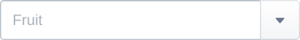


React
React
Vue
Angular
React Native
Add dependency... help_outline
Just any of the 1 million components
and packages in Bit or NPM to the example.toggle layout


chevron_left
chevron_right
Implements some APIs from ui-box.
The options to show in the menu.
The selected item when controlled.
Function called when value changes.
When true, open the autocomplete on focus.
Default selected item when uncontrolled.
The placeholder text when there is no value present.
In case the array of items is not an array of strings, this function is used on each item to return the string that will be shown on the filter
Properties forwarded to the input. Use with caution.
Properties forwarded to the button. Use with caution.
Properties forwarded to the autocomplete component. Use with caution.
Makes the input element disabled.
When true, show a loading spinner. This also disables the button.