
textarea
v4.15.0arrow_drop_downv4.15.0
STATUS
Passing
DOWNLOADS
181
LICENSE
MIT
VISIBILITY
Public
PUBLISHED
5 years ago
SIZE
N/A
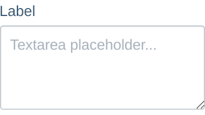
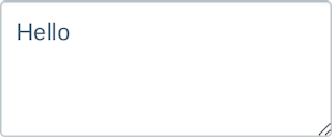
The Textarea components maps directly to a textarea element.
1 contributor

Like
Install textarea as a package?
Copied
npm i @bit/segmentio.evergreen.textarea
Set Bit as a scoped registryLearn more
npm config set '@bit:registry' https://node.bit.cloud
Component Example 
React
React
Vue
Angular
React Native
Add dependency... help_outline
Just any of the 1 million components
and packages in Bit or NPM to the example.toggle layout


chevron_left
chevron_right
Properties
| Name | Type | Default value | Description |
|---|---|---|---|
required | bool | Makes the textarea element required. | |
disabled | bool | false | Makes the textarea element disabled. |
isInvalid | bool | false | Sets visual styling of only the text area to be "invalid".
Note that this does not effect any |
spellCheck | bool | true | Use the native spell check functionality of the browser. |
grammarly | bool | false | Allow the Grammarly browser extension to attach to the backing textarea. |
placeholder | string | The placeholder text when there is no value present. | |
appearance | string | 'default' | The appearance of the TextInput. |
width | string | number | '100%' | The width of the TextInput. |
theme (required) | object | Theme provided by ThemeProvider. | |
className | string | Class name passed to the button. Only use if you know what you are doing. |