typography
v4.15.0arrow_drop_down


Composes the Box component as the base.
Size of the text style. Can be: 300, 400, 500.
Font family.
Can be: ui, display or mono or a custom font family.
Theme provided by ThemeProvider.
Small can only be used inside of Text or Paragraph.
Composes the Box component as the base.
Size of the text style. Can be: 300, 400, 500, 600.
Font family.
Can be: ui, display or mono or a custom font family.
Theme provided by ThemeProvider.
| Name | Type | Default value | Description |
|---|---|---|---|
appearance | 'default' | 'minimal' | 'default' | The appearance of the code. |
theme (required) | object | Theme provided by ThemeProvider. | |
className | string | Class name passed to the button. Only use if you know what you are doing. | |
size | 100 | 200 | 300 | 400 | 500 | 600 | 700 | 800 | 900 | 500 | The size of the heading. |
marginTop | bool | number | string | Pass | |
theme (required) | object | Theme provided by ThemeProvider. | |
rel | string | This attribute names a relationship of the linked document to the current document. Common use case is: rel="noopener noreferrer". | |
href | string | Specifies the URL of the linked resource. A URL might be absolute or relative. | |
target | string | Target atrribute, common use case is target="_blank." | |
color | string | 'default' | The color (and styling) of the Link. Can be default, blue, green or neutral. |
theme (required) | object | Theme provided by ThemeProvider. | |
className | string | Class name passed to the link. Only use if you know what you are doing. | |
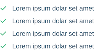
icon | string | When passed, adds a icon before the list item.
See Evergreen | |
iconColor | string | The color of the icon. | |
size | 300 | 400 | 500 | 600 | 400 | Size of the text used in a list item. Can be: 300, 400, 500, 600. |
size | 300 | 400 | 500 | 600 | 400 | Size of the text used in a list item. Can be: 300, 400, 500, 600. |
icon | string | When passed, adds a icon before each list item in the list You can override this on a individual list item. | |
iconColor | string | The color of the icon in each list item in the list. |

