
1 contributor

Like
Install date-time as a package?
Copied
npm i @bit/totalsoft_components.ts_react_components.date-time
Set Bit as a scoped registryLearn more
npm config set '@bit:registry' https://node.bit.cloud
Component Example 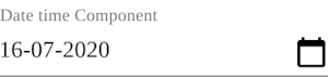
React
React
Vue
Angular
React Native
Add dependency... help_outline
Just any of the 1 million components
and packages in Bit or NPM to the example.toggle layout

chevron_left
chevron_right
Properties
| Name | Type | Default value |
|---|---|---|
value | any | null |
onChange | function | () => { } |
dateFormat | string | "DD-MM-YYYY" |
timeFormat | string | "HH:mm" |
label | string | "Date Time" |
disabled | bool | false |
variant | "dialog" | "inline" | "static" | "inline" |
views | "date" | "year" | "month" | "hours" | "minutes"[] | ["date"] |
autoOk | bool | true |
disablePast | bool | |
disableFuture | bool | |
disableToolbar | bool | true |
allowKeyboardControl | bool | |
ampm | bool | false |
showTime | bool | |
error | bool | |
helperText | string | |
clearable | bool |